Showing posts with label Painting and Weathering. Show all posts

Tuesday, November 9, 2021

Pre-WWII steam lettering color - another data point?


One of my long dormant projects that's at last getting off the "to-do" list is to detail, paint and letter a couple of steam locomotives in the "pre-WWII" style of lettering. I've blogged on this topic several times - see this POST  for some background information. 

Matthieu Lachance did some artwork for this longer ago than I care to admit - the post showing what his artwork looked like can be found in THIS 2020 post. 

The one fairly significant piece of the puzzle I don't have a definitive answer to is what color the lettering was. 

We do know, based on the well-researched Canadian National Steam by Donald McQueen that in 1912 the standard color for steam locomotives was black with numerals and lettering in "standard golden yellow." But in 1919 that was changed for the CNR and GTW to "white or aluminum 12-inch block lettering (gothic) stencilled onto the tender sides.  But when Matthieu and I were researching the lettering we found one - that's exactly one - CV locomotive with the Gothic block lettering. All the rest of the CV locomotives retained their serif style lettering in one form or another through WWII. 

McQueen offers some details on CV lettering without any comments on the color in the CV roster volume of his amazingly in-depth series. Some notes that may prove helpful to blog readers:

1. Pre-1895 or so CV used two styles of tender lettering. The "undulating spelled out road name" was primarily used on leased system engines, such as the O&LC, New London Northern, and Rutland. The "CVRR" initials were primarily used on "home road" engines. Locomotives painted in those schemes we know were delivered from the factory with gold lettering. 

2. In 1899 the GTR assumed control of the CV, and instituted a locomotive renumbering. The "standard" paint scheme at this time became the lettering in the photo of no. 395. In 1917 the striping around the side of the tender disappeared. Shortly after, the road name on the tender also disappeared. 

3. Between 1923 and 1927 the only change to the CV lettering was the addition of haulage rating (as a percent) centered under the road name on the side of the cab. The white outlined "Central Vermont" box monogram on the side of the tender first appeared with the delivery of the 2-10-4s in 1928.  

All of this begs the question if the CV didn't change its locomotive paint scheme in 1919 to keep pace with the new GTR system standard - AND the lettering was "standard golden yellow" IS IT possible the CV retained the yellow lettering? 

It's possible, but I don't think it's likely. 

Recently I stumbled across a couple of web sites that will colorize black and white photos - and while I don't think they're perfect - actually far from it - I thought it wouldn't hurt anything if I uploaded several of the photos I have of pre-WWII CV engines and see what color they think the lettering was. 

The results were interesting, to say the least. I've included a photo of 2-8-0 395 in both the monotone and colorized version. 

I'm not going to upload the other dozen or so photos I colorized (for the record I tried three different online services - the one shown here is from a site called "MyHeritage.")  I found the photos were all somewhat faded. 

Notice the lettering under the cab windows has a slight - but very definite - overall yellow tone. And so does the tender lettering. However, careful study of the right side of the "9" on the tender seem to show the lettering is may have been some sort of white, light gray, or perhaps something similar to aluminum paste. 

I'm not sure what the answer is, but since the CV didn't change their lettering style in 1919 with the rest of the GTR I think I have a pretty strong case for the golden yellow lettering. 

When I have the decals printed I think I'm going to go with both colors - but my personal preference is the yellow - I think it looks sharper! 


Saturday, August 22, 2020

Concrete Texture

Progress continues in the basement, but some limited summertime activities and a distraction (more on that below) have kept me away from any long duration model railroad work sessions. 

I did, however, manage to get the implement dealer completed, mostly in preparation for a clinic I'm called "Researching and Scratchbuilding Tips for Prototype Structures" at an online RPM meet later today. I wanted to finish the building for the clinic, which I did, but the bigger challenge was taking what was a long clinic (last time I presented this live it ran 55 minutes), adding more information to it, and then editing it down to fit the 30 minute time slot. I think I'm in good shape - but I did remove some of the "here's two or three ways you can do this step" - limiting the talk to what I actually did. 

Just after dusk. Obviously some light discipline is called for!

We'll see how that works out. I'm doing the same clinic for our local NMRA division later in the year (October, as I recall). So at least I'll get one more use out of it. I think the idea of 30 minute clinic slots is particularly good - frankly I think it should be used when (or if) we get back to having live meets and conventions. I've sat through a lot of clinics over the years that would have benefitted from some harsh editing!

 On to the main topic for today's post. When I built the implement dealer I added a poured concrete foundation made from .040" plain sheet styrene. I did sand the surface of the styrene prior to painting in order to get it to look like something other than smooth plastic. I painted it and thought it looked okay - until I took some test photos of the building, Those foundation walls were missing any texture.

I have AK Interactive's Concrete (they make an identical material for asphalt, the only difference is the color). It's basically some sort of joint compound-like stuff with a gritty texture added. And, while the texture is great for larger scales, or even HO scale pavement if you apply it carefully and smooth it well - it's really meant for larger scales such as 1/32nd military models and the like. In HO it looks just a little too chunky to make a convincing concrete wall.

I showed the AK Interactive stuff to my wife (leaving out how much I'd paid for a tiny tub of this stuff!) and explained the chunky problem. She dug through her art supplies and handed me acontainer of "Ceramic Stucco Medium" - basically matte gel medium with some fine, gritty material added. The difference was this gritty material was much finer than the AK Interactive stuff. 

After I taped off the clapboard sections of the walls to avoid any overspill, I dabbed this stuff right out of the jar (you can thin it and color it with acrylic paints, in fact that's what it's made for) along the base of the styrene. In this case, I didn't color it, or even paint it. It dries to nice "almost new" concrete color out of the jar. It has a decent working time - so I had lots of time to spread it smooth with an artists spatula. 

I found it naturally formed some uneven spots in various places - looking exactly like a poured concrete wall. If you were modeling a stucco building you could easily use this to create a look of failing stucco with the underlying brick showing through. Or, if you wanted it to look like patched concrete you could let an initial application dry, and then add a second partial coat in a different color.

Before the next step I suggest letting it dry completely - preferably 24 hours or so. When it dried it looked just a little too heavy - but some light sanding to just knock the surface down, followed by a couple of applications of Pan Pastels gave some variation to the color and helped smooth the surface just a little. One more tip - if you're going to color it add the paint to the material before you apply it. I don't think "surface painting" this after it's dried would be as effective. 

All in all I'm pretty pleased with the final result:


About that distraction - over the last couple of weeks of evenings I've been painting some 28mm Revolutionary War (American War of Independence to any Brits out there!) figures. Years ago I was heavily into wargaming - even did some re-enacting way, way back when. I was never into "winning" war games - but I did always enjoy researching the uniforms and painting figures to represent them. I haven't done any miniature figure painting for many, many, years - but out of the blue a few weeks ago I dug out a couple of old boxes of figures and decided to paint them. I quickly found I'm really out of practice. 

But here's a very much in progress shot of a British Regiment - the various figures shown are representative of the Center (also called Line, or "Hat"), Grenadier, and Light Companies of His Majesty's 63rd Regiment of Foot. 


Thursday, September 19, 2019

(Somewhat) Weathered Windows

LEFT: Window primed with Tamiya Tan and Hunterline Driftwood wash. RIGHT: Window primed with Hunterline Light Gray. CENTER: After drybrushing white. 
I've long been frustrated at the results I've gotten painting and weathering plastic window castings. I'd find more often than not the walls on my models - even the styrene ones - would look pretty good. However, the plastic window and door castings always looked like fresh and newly painted. That might be acceptable for a well-maintained building, but what if you want things like windows and doors to show the ravages of time? 
The logical approach would be to paint the plastic castings white and then weather them. After all, that's what happens on the prototype. Honestly, for darker windows it's not as much of a problem. But most windows, no matter what the color of the building walls, tend to be white. So the trick becomes weathering a light colored window. 
I tried airbrushing those white windows with some earth tone paint. And I tried washes of India Ink and alcohol, pastel chalks and drybrushing colors such as Raw Umber and Grimy Black. The results always ended up looking like someone had streaked, airbrushed or chalked a dark color onto a white window. And though I took some solace in the fact that my results were consistent, they still looked awful. 

An Experiment
As I was painting the windows for the implement dealer it occurred to me that the solution may be to reverse the "paint final window color then weather" process. 
After removing most of the sprues and gates from the windows, I taped them to a scrap of cardboard on a roll of painter's tape (the Green Frog kind - but the blue tape works just as well!).
Then, instead of reaching for the can of white spray paint, this time I sprayed everything with Tamiya Flat Tan. After that dried, I gave the castings a quick wash of Hunterline stains. I found Light Gray (shown here) and Driftwood seem to produce a pleasing "soft" warm almost-but-not-quite black color. 
After I waiting for the stain to dry completely - more than 48 hours in the case of the doors and windows in these photos - I went over each with a light drybrushed coat of white paint. A little goes a long way here - and I found a light touch is required. I did get acceptable results after a few practice attempts (see lead photo above and the door photo below). 

If you can't tell, I'm quite pleased with the results. 

Friday, October 20, 2017

Building Thresher's Mill - Addressing disparate materials and critiques

I’ve been trying to find a few minutes each day to make progress on Ben Thresher’s mill. I’ve also been posting photos of my progress on a couple of forums devoted primarily to craftsman structure kit modelers. Model railroading is really an umbrella for a number of widely divergent hobbies and interests – ranging from organizational politics (ie., the NMRA) to historians, to more traditional skill-related subsets such as electronics, carpentry, rolling stock modeling, and yes, craftsman structure building. 
I normally prefer to work in styrene, even when depicting frame structures. While I’ve certainly built wood models before I believe there's always room to improve one’s modeling and try different techniques. 
A few days ago I posted the following photo on both forums: 


and it wasn’t long before I received comments pointing out an issue. While the walls look good, those windows look newer, and freshly painted, compared to the wall. 
I could almost sense the hesitation from people posting these comments – like they didn’t want to come across as too harsh or seem to be one of those dreaded “nitpickers.” Actually, I welcome valid criticism. After all, I’d posted the photos on a forum for structure builders in order to learn and improve my techniques. 
I think the real issue is the windows looked, not like weathered painted or stained wood, but like painted plastic – which is exactly what they are. Placing them atop the weathered wood walls only accentuated the disparity in the two materials. 
I’m not at the point - yet - of scratchbuilding HO windows from stripwood. But I knew I had to do something. But what? Surely experienced craftsman structure builders have encountered this issue. How do they address it on their models? 
Luckily some folks offered not only the comment but added a path forward. One such suggestion: 

“… the windows just need a little weathering. Some A/I, or a light wash of black acrylic. You could also do a little scraping with a dull blade or a finger nail sanding stick...Overall it is looking very good.”

That’s precisely what I did – I got out of the fiberglass eraser and was a little more diligent in my scraping. I even dug a dull used Xacto blade out of the “sharps” container and used it to gently scrape a few areas of stubborn paint. Once the scraping was done, I used a small brush to carefully paint some Hunterline A/I stains in various grays and browns and allowed that to dry overnight. Last night I used a small stippling brush to rub – almost scrubbing - an assortment of red, brown, and gray Bragdon powders into the plastic windows. 
Finally, I'd received a couple of suggestions to darken the walls just a little more - so before I glue the windows in place I added another application of Hunterline Blue Grey wash to walls. This also helped the "weathering" on the walls, and the nail heads, pop. 
The result is shown below. 

Time to start assembling the clapboard onto the subwalls. 

Couple of lessons learned so far: 
1. The fact that I’d already glazed the windows made the additional weathering a little more problematic. In the future, weather the windows completely before glazing.
2. Priming the window castings in a wood tone will add one more layer of color to reveal with the scraping and buffing technique. 

Sunday, September 3, 2017

Westerfield I-GN boxcar - ready for weathering

I finished dealing the Westerfield I-GN boxcar, and added an overcoat of Future floor polish followed by a coat of Vallejo Matte clear. I think it makes a nice addition to the "late 1920s" roster. 

I think I'm going to hold off on weathering the car until I get some other half-finished freight car projects completed. 

Sunday, September 25, 2016

SNE Wiggle Worm

Over the years I've had folks who model a later era that I've never really modeled ask what the lettering for my Southern New England would have looked like post-1961. 

A few months back, Bernie Kempinski and Otto Vondrak worked with me to develop the initial concepts for a “new image” SNE “wiggly worm” logo. The graphic challenge was how does one “link” the letters “S,” “N”, and “E” - try it - it’s not as easy as linking two letters like “CN” or even “CV.”
The answer lay in the approach the DWP took - the graphic designers for CN way back in 1961 obviously had the same issue linking the letters together. The solution was to not even bother trying!
I have to give Mike C credit for suggesting the DWP possibility - and all the credit (or blame if you don’t like it) for the logo goes to Otto. 
Thanks to all, here, for the first time, is a poor color rendering of what this scheme might look like on one of the SNE’s GP9s after repainting in the North Providence shops in 1965….


Appreciate any and all thoughts - 

Here's a version of the lettering scheme in the later green/yellow:


Tuesday, March 8, 2016

Pre-WWII steam locomotive lettering


CV 218 in a 1915 portrait shows the locomotive scheme in vogue from the early 1900s to the early 1930s. (Although some engines kept this scheme until 1938 based on photo evidence).
Got an interesting email inquiry a few weeks back asking about the lettering on early (pre- World War II) Central Vermont steam locomotives.
From what I’ve been able to determine, the CV gradually shifted to using the “monogram” square herald through the 1930s. Builder’s photos of the 700-series 2-10-4s (1928) show these engines were delivered with the square herald on the tender. In all likelihood the lettering was white and the herald was the same color as the rest of the tender. At some point the background color of the herald shifted to green with gold (deluxe) lettering. These monograms would be applied to the steam fleet throughout the 1930s. During WWII, the background color changed to red. All these changes took place gradually, and there is photo evidence showing the green heralds in the mid- to late 1940s in at least one color photo that's been published.  
But how were the steam engines lettered prior to the delivery of the 2-10-4s?
Basically, the lettering style reflected the practices of the Grand Trunk Railway (of which the CV was a subsidiary) during the 1900-1930 era. 
This shot of 206 dates from 1908. Note the san-serif lettering style. 
There were some variations in style of lettering and striping, but basically the scheme featured large locomotive numbers on the side of the tender and the words “Central Vermont” spelled out under the cab windows. Someone told me once the reason for the common use of large tender numbers was the requirement for agent/operators to be able to clearly read the numbers of passing extra trains. I'm not entirely convinced, but it makes a neat story!
At first the lettering was a sans-serif style, but eventually it shifted to a style similar to Railroad Roman. The last locomotives delivered in this scheme were the U-1-a class 4-8-2s (600-603).
By 1914 the 203 had Roman style lettering. Indicating the change from sans-serif to Roman lettering occurred sometime between 1908 and 1914. 
Also, photos show the tender had rectangle striping outline around the the tender side, although this was apparently removed on some engines by the mid-1920s.
The photos, and dates, show some of this evolution.
Very early photos of CV locomotives show an arched lettering style with a block lettering typeface. Rutland Railroad (controlled by the CV at the time) locomotives were often lettered with "Rutland Division" under the Central Vermont road name. Builder's photos of locomotives from the early 1880s show the name of the locomotive under the cab, the number on a numberplate on the smokebox, and "CVRR" on the tender sides in a Railroad Roman style lettering. This lettering was most likely Duluxe Gold with contrasting shadows, which would have been keeping with a frequently used style of locomotive lettering from the time. 

A 1914 view of the 408, one of the largest engines on the roster at the time.

No. 210, circa 1924. Note the lack of the striping on the tender. Photos show some engines had the tender striping, some didn't. I can't readily identify any logic to which do and which don't.  


The "Ethan Allen" was built in 1854, and looked like this until it was rebuilt in 1871. This shows the CV RR lettering in use from the Civil War through the 1880s. 
Number 83, the "Joseph Hickson" as it looked when built by the Rhode Island Locomotive Works in 1883. Lettering has gone from spelled out roadname to the railroad initials.  
In the late 1800s and early 1900s the CV went through several receivership's as well as a wide scale re-lettering and renumbering of the locomotive roster. It was during this time that the names were removed from the older locomotives, and they became identified simply by a number. 
Answers to a couple of obvious questions have been elusive – especially the color of the lettering in the 1900-1930 era. Common practice of the time would be either “gold” (deluxe), white, or some type of aluminium or light gray. 
0-8-0 505 in New London in 1933 has the now-familiar tilted monogram. But is the background black, green, or red? (Hint - Most likely green…). As an aside, note the style of lettering on the boxcar. 
Grand Trunk used white lettering, and lacking any hard evidence to the contrary, if I was going to model an engine of this time period I’d go with white. You’re on your own for decals though, since no one makes them. It would be interesting to see a CV layout set in this era as opposed to the far more common steam-to-diesel transition era.  There are a number of other advantages to modeling this era, once the basic challenges of finding the appropriate motive power and lettering are solved.

Thursday, December 3, 2015

Central Vermont stenciling diagrams

An ongoing discussion on the Steam Era Freight Cars Yahoo Group started as a discussion of various railroad rolling stock lettering types/styles. This naturally morphed into a discussion of "stenciling diagrams"  - full size diagrams that shop crews would use when lettering equipment. 
Some railroads called these "heralds," many called them "emblems" - on the CN family, including the Central Vermont, the diagrams were most often referred to as "wafers." 
Here is the CV stenciling diagram for the familiar steam locomotive tender lettering (also used on one of the milk car schemes), the familiar CV "tilted wafer":
And here is the diagram for the Maple Leaf monogram applied to the ends of the diesel locomotives and sides of some passenger cars:


I also have the maple leaf used on the vans, but haven't scanned it yet. 

Saturday, June 6, 2015

Stamping out the Shine...

The FGE car on the left shows the out-of-the-box shiny wheels and Accu-mate couplers. The MEC car on the right is an Atlas car that's had its truck sideframes and wheels painted Weathered Black and a new Kadee coupler installed. 
 I'm getting the layout ready for an operating session for our local operating group later this month. As I was staging a few trains I realized several of the cars had Accumate couplers. These two-piece plastic couplers don't uncouple easily enough and I usually replace them with Kadees. 
The "ready-to-run" Atlas and Accurail cars also include unpainted - very shiny - silver wheels. 
I've found the Kadee couplers (right) are much more reliable than the Accumate couplers (left). 
Since replacing the couplers meant removing the trucks to get to the coupler box cover, I went ahead and painted the wheels and the truck side frames at the same time. 
Painting the trucks is the first step in weathering any car. I got extra motivated and did an initial coat of weathering on one or two cars - the yellow cars will be weathered at some point in the future. 
I even managed to weather a few of these cars - including this Atlas B&O hopper. 
In the end I spent some time last night and this morning and got the couplers replaced and wheel sets painted on about 15 cars. 
Even without the "full" weathering treatment they look a lot better!

Friday, April 10, 2015

Noodling some Worms

What does one do during an endless telecon at work on a Friday morning? 
Simple, one doodles. 
Years ago I decided to stop fighting it. As a young naval officer I learned to keep notes to myself, work taskers and the like in what we called a "wheel book". I still do. New page every morning. I'm a dedicated doodler meaning my wheel book is filled with mundane work stuff and, of course, doodles. 
Considering yesterday's blog post it should come as no surprise that I tried some more variations of "SNE" in the post-1963 "wet noodle" CN logo. 
On the CV I often heard the employees refer to the CV intertwined logo as a "pregnant tapeworm." 
My collection of SNE wiggly worms is shown above. 
Not quite there but, but a couple of them show some promise? 

*A "Wheelbook" technically is (or at least used to be) a book kept by all naval officers standing bridge watches listing all the helm and rudder commands, ship sightings and the like. Kind of personal ship's log book. It's totally a CYA device. 
It's evolved over the years to mean a running log of work assignments - it's quite common for the ship's Executive Officer to "review your wheel book." That's not considered a pleasant experience!

Tuesday, March 3, 2015

S-2 Cab Heralds


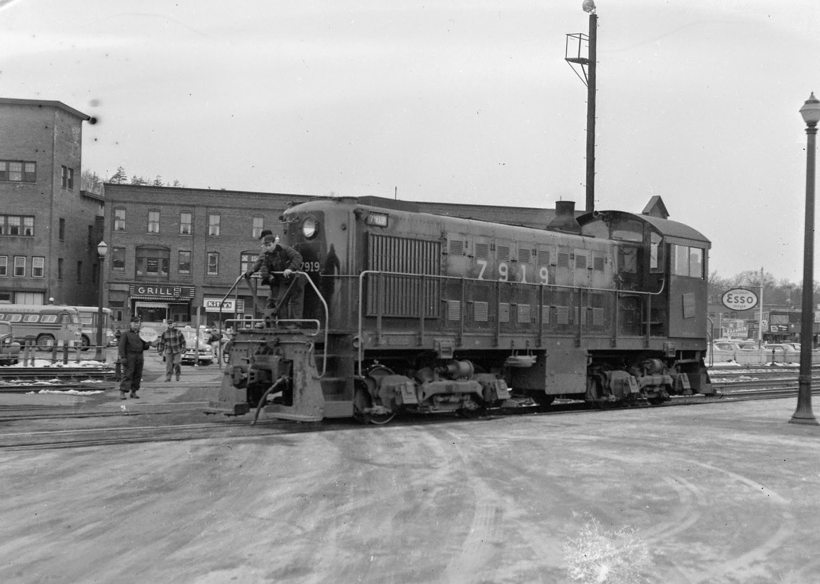
S-2 7919 (above) and 7918 (below) at White River Jct. Note the pinstripe wrapping around the hood - the "as-delivered" scheme.

Central Vermont received its first two diesels – a pair of Alco S-2s numbered 7918 and 7919 in December, 1941.  They were delivered in a basic black paint scheme with large numbers centered on the long hood and a small pinstripe running the length of the hood from the front edge of the cab and wrapping around the nose.  A square CV wafer, titled at a 7.5-degree angle, was centered below the cab windows.  The engines wore this paint scheme, or a minor variation (early, or first repaintings saw the elimination of the pinstripe) until the mid-1950s when a large oval name board replacing the road number on the sides of the hood.  A few years later the square herald gave way to a round CV maple leaf roundel, likely in conjunction with the introduction of the round maple leaf herald on CN family equipment coinciding with the introduction of the black/green “Super Continental” passenger equipment.
The background color square wafer on the side of the cabs of the S-2s has been the source of some discussion.  Here’s what we know:
- The background of the herald on CV’s steam locomotives was green until 1943 when it was changed to the now familiar red.
- The S-2s were delivered in 1941, about 18 months before background color changed.
- There’s no doubt that by the late 1940s, when we have color photos of the S-2s with that the background of the wafer was red.
Now the supposition starts.
It’s evident that the wafers were not painted on the cabs, but were actually metal plates applied to the side of the units - I'm not sure they were delivered from Alco with the wafers or if these were added by the railroad. The latter seems most likely. 
The late Dr. Alan Irwin theorized that it would have been entirely likely that the S-2s were delivered with green heralds on the cab sides, and that these would have been changed to red after they were repainted at some point after 1943.  Of course, Alan was never able to prove this since no color photos of the engines in their first years of service have been uncovered.  On my layout, the switchers painted in this scheme will have red wafers (or the maple leaf ones) but it would be neat to locate a color image confirming if Alan’s suspicions were correct. (For the record, I think they were).


CV 7919 without the pinstripe.

This shot confirms that as of 1951 the cab wafers were red. But were they originally green?

Thursday, November 20, 2014

Would the real CN Red #11 Please Stand Up?

All five of the Canadian National boxcars visible in this photo are the same color - CN Red #11 - aren't they? 
A couple of weeks ago I wrote about the percentages by road name of the boxcars running through White River Junction in 1954. (You can find that post here). 
The one thing that survey revealed was the overwhelming majority of boxcars running through town, and therefore along the line I'm modeling, were Canadian National. I do have a fair number of CN boxcars, but figured I could always add more to the mix. I'll do a separate post at some point on the specific makeup of my CN boxcar fleet, but that's not the point of this post. 
A number of years ago some knowledgeable CN experts, notably Stafford Swain, researched the colors of paint used as "standards" on the CN system. The result of this study indicated "CN Red #11" is the "standard color." You can get it from several model paint manufacturers (for the record, my preferred brand for this color is Scalecoat, but TruColor and Badger both market "CN Freight Car Red" paints.)
But having the "standard" color is nothing but a starting point - a benchmark. 
Note the photo above - all of these boxcars (every one of them) was painted at some point a variation of "CN Red #11."
See how they all look alike?

Friday, June 27, 2014

Tru-Color Paint - we have a winner!
My comments here are limited to airbrushing - I rarely, if ever airbrush things like structures and usually paint them by hand. 
Years ago my go-to paint for painting locomotives and rolling stock was a line of paint called "Accu-paint" from SMP Industries. (Not to be confused with the Accu Flex line of paints that eventually became "Modelflex"). 
I got started using Accu-paint since I modeled New England railroads and Accupaint made a line of decals with paints colored to match. But I found I always had great results with the stuff - it sprayed nice and fine, didn't spatter, gum up the airbrush, or dry with anything other than a smooth, shiny finish perfect for decals. 
A few months ago I stumbled across a bottle of Tru-Color paint at a train show. I'd heard of this paint but had never actually encountered it. "Oh great, more crappy paint" I said to the owner. 
"Try it and see what you think" was his reply. 
Last night I sprayed a car with the stuff - the paint performed beautifully, just like the old Accu-Paint (no surprise since they're essentially the same formula). 
I've used some acrylic paints - primarily the Vallejo brand - with good success as well. With some brands I always seem to get splattering and other issues. 
And no matter what I've tried I always seem to have issues with clear flat finishes from any acrylic paint manufacturer. 
I just tried the Tru-Color clear flat finish - it went on like a dream! 
Tru-Color has also introduced something Accu-paint never did - a line of flat weathering colors. I'm going to try those once I get through tomorrow's operating session. 
I'll post photos later. 
And since someone will inevitably post a comment about solvent-vs-acrylic paints and safety issues I'll add common sense applies. When you're airbrushing anything - including acrylics - you should be using a vented booth and ideally wear a two-stage respirator, gloves, and eye protection. 

Saturday, March 22, 2014

Steam Locomotive Colors - 2

In a previous post (here) I offered an opinion that while steam locomotives can be all shades of black, "Grimy Black" - actually a dark gray - is not one of them. 
I got several email replies to that post claiming that the "shiny" engines were from an earlier era - by the late steam era the locomotives were allowed to get dirty and turn "Grimy Black" in color. Another claimed that since the engine I offered as an example was a passenger locomotive (4-8-2 no. 600) she would have been better maintained.
Such would not be true of, say a workaday 2-8-0 on a way freight. 
Here's a shot of M-3-a 2-8-0 no. 454 working the Southern Division local. This was taken in the fall of 1956 - and 454, and all other CV steamers, would be retired within a few months. Hardly something that would be pulling the pride of the line…and again she's weathered but certainly not Grimy Black. 

Tuesday, February 11, 2014

Steam Locomotive Colors

George Dimond, courtesy Central Vermont Railway Historical Society
 For many years model railroaders were told to paint steam locomotives "Grimy Black" - which is basically a flat, dark gray.  In addition, model railroaders started weathering steam locomotives to appear so old, dingy, and poorly maintained that they looked like they were on the verge of falling apart. 
Supposedly this made the models look better in the low light levels typical of most model railroads - and all that weathering supposedly made the details "stand out." Really, it was another example of the extreme weathering - to the point of caricature - that gripped the hobby in the 1950s and still hasn't let up in some quarters. 

Studying prototype pictures, at least of the Central Vermont, shows the shop and road crews took great pride in their iron steeds, and the locomotives showed a hard-working, but well maintained appearance even in the last few years of steam. 

This shot shows 2-10-4 no. 707 arriving in White River Junction in September 1953. By this point she's the last of her class in service and would soon be relegated to standby duties out of White River Jct. She may be dusty and soot covered in this photo, and appears to have been working hard out of the road, but she's most definitely not gray. 
An even better example is the lead image of 4-8-2 no. 600 being readied for another run at the White River engine terminal. In March, 1954 she's not only not gray or "Grimy Black," she's shiny!
The lesson here is to feel free to paint your steamers black, and to take it easy on the weathering. 
If you find there's not enough light in the layout room then consider adding more lighting to your layout instead of lightening your locomotives. 


Wednesday, September 4, 2013

MicroLux Hobby Acrylics

A couple of months ago many model railroaders were dismayed to learn that Testors was discontinuing production of Floquil and PollyScale acrylic paints. These paints had been a mainstay of model railroaders for years, and based on the reaction to this news in various model railroad forums and blogs many model railroaders were ready to jump off tall buildings.  
Rather than getting overly upset about it, I opted to look for an alternative. One of them landed, quite literally, in my lap as I was flipping through latest Micro-Mark catalog.
In that catalog I noticed MicroMark was coming out with a new line of hobby acrylic paints called "MicroLux." 
The are prethinned for airbrushing just like regular artists acrylic airbrush paints (from manufacturer's like Golden). 

I also noticed Micro-Mark was offering Vallejo "Model Air" airbrush paints in "railroad colors" matched to the now defunct PollyScale and Floquil lines. Vallejo is well known to military and figure modelers as one of the best acrylic paints for model building available anywhere. In the list of the Vallejo and MicroLux colors you'll find many of the old names like "Tarnished Black," "Boxcar Red," etc....
So I went ahead and ordered a few colors of both the Vallejo railroad colors and the MicroLux paints.  

I just got them, so I haven't used them yet. The Vallejo paints are actually Vallejo's line of military colors - and come in the familiar 17 mil "eye drop" bottles. Micro-Mark has determined that Vallejo "Rust" is a color match for Polly Scale "Boxcar Red" and labeled it as such. 
The line of MicroLux paints come in larger bottles - 2 oz of paint in each and are specifically matched colors. I was thrilled to read the "Made by Vallejo" labeling on the Micro-Mark bottles. 
I haven't tried airbrushing with these paints - yet - I will report back with the results, but if these spray half as well as "regular" Vallejo paints but we may have a winner.

Thursday, February 21, 2013

Painting and Installing Corrugated Roofing


The Berry Machine Shop has been sitting on my modeling desk for several weeks untouched. But, with the layout running it was time to turn my attention to it again.
Perhaps the trickiest model roofing materials to work with are the formed metal sheets such as those offered by Campbell, Model Memories, and Builders in Scale. Out of the package this stuff is almost unusable since it’s too shiny and clean. You can chemically etch it with something like Archer Etchant, but frankly it’s a difficult to control process – and a vat of acid is not really all that welcome in our home.  
While it’s easy enough to paint the material, due to the nature of the material it seems to easily subject to chipping and flaking, leaving shiny silver spots on your otherwise weathered metal.  
Here’s the approach I’ve used with success on the Berry Machine main building roof. I started by painting the corrugated metal with ordinary spray can automotive primer gray. Let this dry completely – a couple of days at least.
Then I colored the panels by brushing on a combination of Raw Umber, Raw Sienna, Burnt Umber, Burnt Sienna, Yellow Ochre, White, and Black artist’s oil paints. 
A little paint goes a long way. I thinned the paint slightly (just enough to get it to brush evenly) with Odorless Mineral Spirits. I tried to get it to shift from light to dark across the width of the corrugated material, but frankly didn’t worry about getting the colors from one piece to another, or even along one piece, to match. Again, set this aside to dry completely for a couple of days. It looks pretty bad at this stage. 
Before cutting the material into 4-foot widths, I sprayed the pieces with Testor’s Dullcote. This sealed the roofing and also prepared it for the next step.
I cut the pieces into 4-foot wide strips. 

 Installing the corrugated roofing
Installation was pretty straightforward. I drew guidelines on the roof at the approximate location of the top of each row of corrugated panels. Then I applied double-sided tape to the roof. Installation was a simple as lining up the edge of the panel with the edge of the roof and pressing down. After I worked my way up both sides of the roof, I added a ridge cap fashioned from strips cut from the corrugated panels.
Once the panels were installed, I applied a wash of thinned Polly Scale Tarnished Black, Grimy Black, and Railroad Tie Brown to each of the roof panels. Then, as a final touch, I dusted the roof with with powdered pastel chalks. The completed roof, which may get another touch up of chalk once the building is installed on the layout, is shown above. 

Wednesday, January 2, 2013

Berry Machine - Main Mill Building


I took advantage of the relatively light work schedule at the office, and the fact that we didn’t travel or have house guests for the holidays to spend some time at the workbench.  First up was the Berry Machine main building. I blogged about issues I’d had with two smaller structures that make up this three-building complex in this post and this one last year. The main mill building had no issues with fit and finish and went together very easily.
The look I was going for with this building was “old, but well-maintained.” I did “lift” some of the clapboards (the technique is easy: Start by cutting the board vertically to define the end of the board. Then gently slice the underside of the clapboard with a sharp X-acto, then use a no. 17 chisel blade to pry the board up. You can see how this looks in some of the photos. 
After I added a lot of 1/8” square bracing to the inside walls, I stained the clapboard with Hunterline “Creosote” stain. I have a number of these Hunterline stains, and I use them for all kinds of applications.
While waiting for the walls to dry I prepped the windows and doors. They were all painted white, and then glazed using Canopy glue to add the “glass” to the windows. I painted three  walls Polly Scale Antique White. The front wall was painted with Barn Red craft paint.
After assembling the basic walls, installing the doors and windows, and adding the sub roof panels, I turned my attention to the foundation. This building will sit alongside the mill stream, meaning more of the foundation will be exposed on one side and along the rear than in the front. The kit includes a lot of small plaster blocks for the foundation. To make installing them easier I added a wall of 3/64” basswood sheet glued to the inside of the bracing and extending the full height of the foundation. Then I used a selection of the Hunterline stains (Medium Brown, Sepia Brown, Blue Gray, and Driftwood) to color the individual stone blocks. This was hardly scientific; my main goal was to make the coloration subtle and somewhat varied by staining each stone with the “base” of one color, and then adding variety by dabbing on the other stains to each stone.
Then it was simply a matter of gluing the individual stones to that bass wood foundation subwall.
Once completed, I started carving the foamboard riverbed and bank to shape to accommodate the Berry Machine building. The partially assembled shell is the Ben Thresher mill building. You can also see the start of the mill falls. 
Next step for Berry?: Corrugated roofing.