Monday, December 27, 2021

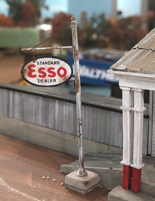
Sign for Streeters Store


Quick one evening project. Actually two evenings since I had to wait for the decals to dry! 

I started with the post from a JL Innovative gas station detail set. (This same set included the Esso gas pumps). I first painted the sign post flat white. Then I painted a piece of thin (.005") styrene dark blue and then applied Microscale Esso decals to the styrene. I snuggled the decals in place with Solvaset and let them dry. Once they were dry I carefully trimmed around the edges of the decal, flipped the sign over and applied a second Esso decal sign to the opposite side. I allowed the decals to dry completely overnight. 

I rusted the edges of the sign and the post with Raw Umber and Mississippi Mud acrylic paints applied sparingly with a piece of torn sea sponge.   I got this technique for rusting signs watching Jason Jensen's YouTube channel. 

I fabricated the crossarm for the sign from pieces of brass wire. 

The base is basswood coated with Ceramic Stucco to give it a little concrete texture. I painted it with light tan acrylic paint and weathered it with some rust colored chalks. 


Friday, December 24, 2021

Merry Christmas 2021


Simply haven't had time to post much over the last month but wanted to be sure to share our wishes that you and yours have a happy, holy, and joyful holiday season! - Marty and Christine 


Wednesday, November 24, 2021

Streeters Store update and more scenery

The next project is getting the scenery completed in the Sheldon Junction scene between the junction crossing itself and the large river crossing. Stic came over a few weekends ago and between the two of us we were able to make some cuts into the benchwork to plant the Streeter's Store. Like most South River kits this one can be built "at grade" - in other words on a flat piece of ground, or can be built to include varying levels of terrain. Obviously the latter is almost always more interesting, but it can sometime present a few challenges! In this case we had to slightly widen the benchwork and dig down into the plywood subroadbed. And naturally the logical spot for the store was directly over the legs to one of the IKEA Ivar cabinets....

Nothing a saw couldn't take care of though!

I turned my attention to finishing up some more details on the store. The South River kit includes the really old fashioned glass top gas pumps - they just seemed a little too vintage for my era so I replaced them with pumps more typical of the 1930-50s era. 

Still to come is some additional signage. 

Obviously the ground is strictly the base terrain - I'll add some tile grout "soil" shortly, as well as installing the road proper. 

The foreground tree is a placeholder for how - frankly I like how it frames the store so the tree may well grow roots!

I was thinking about adding a farmhouse across the street from the store (basically between the curved interchange track and the store in the overall photo). But when I added a house as a mockup it just seemed like one too many elements in the scene. 

The only other structure will be the Campbell water tank - that's one of the first "real" models I built and I've had it on every layout since I was a teenager. Thought I should include it here!


Tuesday, November 9, 2021

Pre-WWII steam lettering color - another data point?


One of my long dormant projects that's at last getting off the "to-do" list is to detail, paint and letter a couple of steam locomotives in the "pre-WWII" style of lettering. I've blogged on this topic several times - see this POST  for some background information. 

Matthieu Lachance did some artwork for this longer ago than I care to admit - the post showing what his artwork looked like can be found in THIS 2020 post. 

The one fairly significant piece of the puzzle I don't have a definitive answer to is what color the lettering was. 

We do know, based on the well-researched Canadian National Steam by Donald McQueen that in 1912 the standard color for steam locomotives was black with numerals and lettering in "standard golden yellow." But in 1919 that was changed for the CNR and GTW to "white or aluminum 12-inch block lettering (gothic) stencilled onto the tender sides.  But when Matthieu and I were researching the lettering we found one - that's exactly one - CV locomotive with the Gothic block lettering. All the rest of the CV locomotives retained their serif style lettering in one form or another through WWII. 

McQueen offers some details on CV lettering without any comments on the color in the CV roster volume of his amazingly in-depth series. Some notes that may prove helpful to blog readers:

1. Pre-1895 or so CV used two styles of tender lettering. The "undulating spelled out road name" was primarily used on leased system engines, such as the O&LC, New London Northern, and Rutland. The "CVRR" initials were primarily used on "home road" engines. Locomotives painted in those schemes we know were delivered from the factory with gold lettering. 

2. In 1899 the GTR assumed control of the CV, and instituted a locomotive renumbering. The "standard" paint scheme at this time became the lettering in the photo of no. 395. In 1917 the striping around the side of the tender disappeared. Shortly after, the road name on the tender also disappeared. 

3. Between 1923 and 1927 the only change to the CV lettering was the addition of haulage rating (as a percent) centered under the road name on the side of the cab. The white outlined "Central Vermont" box monogram on the side of the tender first appeared with the delivery of the 2-10-4s in 1928.  

All of this begs the question if the CV didn't change its locomotive paint scheme in 1919 to keep pace with the new GTR system standard - AND the lettering was "standard golden yellow" IS IT possible the CV retained the yellow lettering? 

It's possible, but I don't think it's likely. 

Recently I stumbled across a couple of web sites that will colorize black and white photos - and while I don't think they're perfect - actually far from it - I thought it wouldn't hurt anything if I uploaded several of the photos I have of pre-WWII CV engines and see what color they think the lettering was. 

The results were interesting, to say the least. I've included a photo of 2-8-0 395 in both the monotone and colorized version. 

I'm not going to upload the other dozen or so photos I colorized (for the record I tried three different online services - the one shown here is from a site called "MyHeritage.")  I found the photos were all somewhat faded. 

Notice the lettering under the cab windows has a slight - but very definite - overall yellow tone. And so does the tender lettering. However, careful study of the right side of the "9" on the tender seem to show the lettering is may have been some sort of white, light gray, or perhaps something similar to aluminum paste. 

I'm not sure what the answer is, but since the CV didn't change their lettering style in 1919 with the rest of the GTR I think I have a pretty strong case for the golden yellow lettering. 

When I have the decals printed I think I'm going to go with both colors - but my personal preference is the yellow - I think it looks sharper! 


Monday, November 8, 2021

"Live" Clinics and even a "Live" Visitor!!


Of course, you never notice things like the "chipped paint" on the sill - actually a decal issue - or the bent handrail in front of the cab - UNTIL you take a photo!!! 

I did an in person version of the scenery clinic at the local NMRA division meet this past weekend. 

Thrilled more than a couple of people showed up. I didn't get a head count, but I think there were 40 or so people in the room - it certainly seemed full. Got several questions, and no one snored so loud that they woke up the person next to them ...

All kidding aside, after doing remote clinics for the last two (?) years I’d forgotten how much I missed the interaction and immediate audience feedback - not so much for feeding my ego - but for getting a feel which portions of the clinic are perhaps more interesting than others. 

Also, jokes actually land - ever try to tell a joke during a virtual clinic??? …. Result is always the same - Crickets!!!

After the clinic, and the always exciting door prize drawing (I won a Bowser GL hopper) I grabbed lunch with Bill Schultheiss and Rich Steinmann. Bill had asked to come by and see the layout - he actually grew up in the Richford area so I was interested in hearing his thoughts on the layout. We had a great visit. I think he was pleased - hope he can stop by and visit again sometime. 

Since I didn't bother to take any photos either at the Division meet or of Bill standing in front of the layout you'll have to settle for a shot of SNE RS-3 1854 running north of Williams Creek. 


Sunday, October 31, 2021

New siding for "Stafford Mills"

The fact that even the "first coat" of the backdrop painting stops
here is a clue that the Stafford Mills area of the layout is unresolved. 

As originally planned, Stafford Mills (essentially my freelanced version of Sheldon Springs) was the location of a major single industry - in this case a paper mill complex located at the end of a dedicated stub peninsula. But as I built the layout I realized there would be room for a siding with one or two very small industries at opposite the junction switch on the passing siding (the junction switch with the mill lead forks off from the mainline). 

In this case I didn't have to remove anything so this wasn't so much a "rework" as it was an addition or an enhancement. I could even make the argument this didn't add any additional track to the layout since I'd removed a turnout and a siding from the junction area as part of the rework of that trackage I described a few months ago. 

I was out of Micro Engineering no. 6 code 70 turnouts - as is everyone else. So I decided to handlay the necessary turnout. Although this added a couple of evenings to the project I'm glad I did - the turnout works perfectly, and cars and locomotives (even brass steam locomotives!) pass through both routes without so much as a click! I'm not wishing any additional work on myself, but if any of the Micro Engineering turnouts on the rest of the railroad fail or prove troublesome I'm simply going to replace them with handlaid ones.  

The buildings shown in the photos are strictly placeholders and may, or may not, end up in these locations permanently. I kind of like the idea of a station in between the mill lead and mainline, so that will likely stay (I may build a different station for the spot. The one shown is a model of the Richmond, Vermont station - although that perhaps the closest to a "standard" CV small depot design as the railroad had. But there are a couple of Grand Trunk (NEL) stations I've always liked and may well scratchbuild one of those for this spot. 

The freighthouse is a Walthers cheapo model that I painted and lettered in "close enough" CV colors. It's not bad .... but the weakest point is the platform - despite my best efforts it's still too bulky. I should have replaced it with a scratchbuilt wood one. I do have a BEST Trains kit that may work better in this spot, if I decide to stick with the freight house. 

The red rectangular building is simply there to fill space and see how a larger industry would look in that spot. I'm not convinced it's going to work there - especially with the freight house. The answer is looking like (1) freight house and something that isn't a large building - a coal yard for example or team track OR (2) a larger building industry with no freight house. Since there's going to be plenty of large buildings in the mill complex I'm leaning towards option #1. 

My ultimate plan for the area with inside the mainline curve (with the yellow building) is to ultimately have a mill river with one or two larger wooden mill structures over a mill stream, complete with mill falls, etc. ... But that sounds like it may take months/years to get completed. This may well simply end up as some open fields and a tree line "for now" to get a large portion of the landscape to look finished with the idea I could revisit it at some future point.